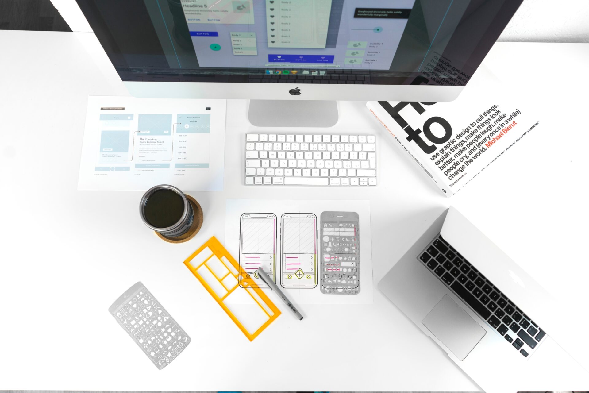
Successfully planning and developing your web projects can be a feat. Often times we find ourselves having to navigate tight deadlines with limited room for error. With website creation there are many possible points of failure; being able to optimize processes while working through a project can make all the difference.
Part of the design phase should not only take into account the aesthetic of the brand however should also outline the different functionalities and strategic approach of the user experience.
In other words as you are designing you need to always keep in mind how this will translate into the actual development of the project.
If you are in a setting where you have direct access to a developer you may be able to bounce ideas and confirm if the design elements you are including can in fact be pulled off effectively.
In other cases where you the designer are also the developer; you can pre plan integrations in the design phase to save time and streamline certain function decisions later on.
Whether you are styling your own responsive grid system or using an existing library such as Bootstrap, knowing in advance how your columns and rows will stack will save you valuable time later in development.
Some optimization can involve the removal of certain unnecessary or cumbersome processes. One process that can be removed from your own workflow today is the initial grid setup. If you are just starting out your design journey or want to save some time in setting up your grid and margins to stay consistent consider using my Responsive Wireframe Templates.
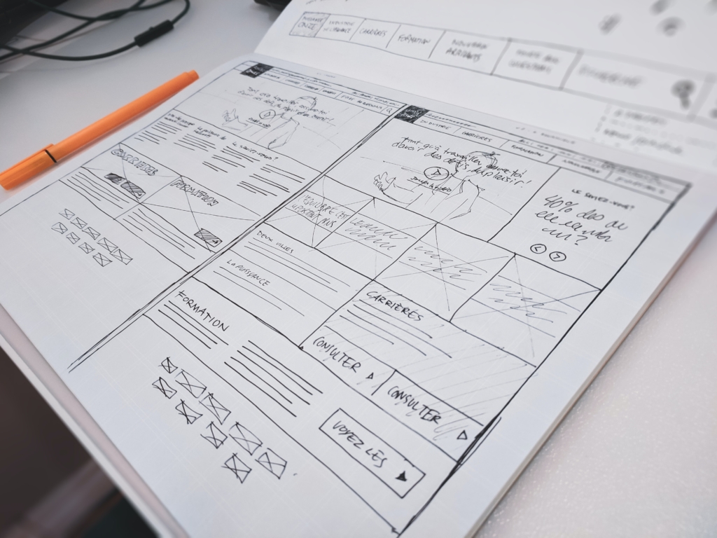
Wireframes set the boundaries and can relay important information about the layout and functionality to be used. It is just as important to understand these rules at a basic level so as to communicate effectively, especially if someone other than yourself will be coding the design.
Using a grid to layout your design helps in aligning margins and sections. It is also is extremely helpful when designing for responsive websites.
Whether you are styling your own responsive grid system or using an existing library such as Bootstrap, knowing in advance how your columns and rows will stack will save you valuable time later in development.
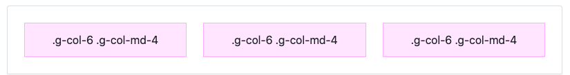
For those new to grid systems or responsive libraries such as Bootstrap etc. consider the following grid logic (Those of you who have already worked with bootstrap can skip forward): In this example we reference the Bootstrap library.
The grid has a total of 12 columns horizontal which can be separated into different groups of columns which all must equal 12. (For instance a column of 6 and 6 or 50% would display two equal column sections each spanning 6 columns. Similarly a column of 4 and 8 would display a smaller column of 4 followed by larger column of 8).
<div class="grid">
  <div class="g-col-6 g-col-md-4">.g-col-6 .g-col-md-4</div>
  <div class="g-col-6 g-col-md-4">.g-col-6 .g-col-md-4</div>
  <div class="g-col-6 g-col-md-4">.g-col-6 .g-col-md-4</div>
</div>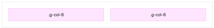
<div class="grid">
  <div class="g-col-6">.g-col-6</div>
  <div class="g-col-6">.g-col-6</div>
</div>
For more information reference the full documentation here – https://getbootstrap.com/docs/5.1/layout/css-grid/#responsive
These elements will resize depending on the area or width of the browser – via CSS media-queries – therefor formatting to mobile and tablet dimensions (in addition to various desktop sizes) without the need of a dedicated mobile and tablet code base.
Now that you know a little about the basics and hopefully it was explained well enough; The next step is to put it all together and start laying out what will soon be the first draft of more than likely several client revisions.
My workflow consists of first laying out the main sections needed in list format.
Second I begin to create a rough wireframe taking into account what content should be strategically placed in key areas.
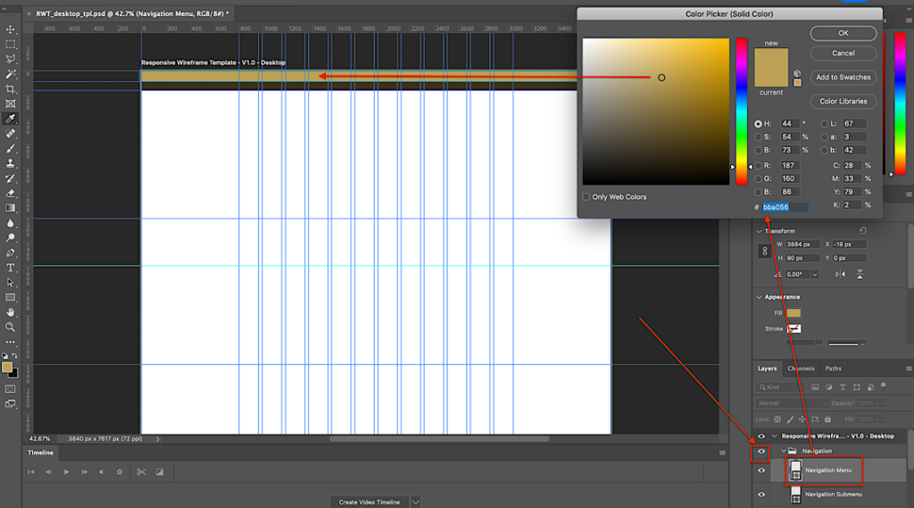
To streamline this process I have designed a template wireframe with preset guides to help speed up the design process by eliminating inconsistencies and providing pre-set area guides. This comes with a mobile wireframe guide as well as a desktop wireframe.
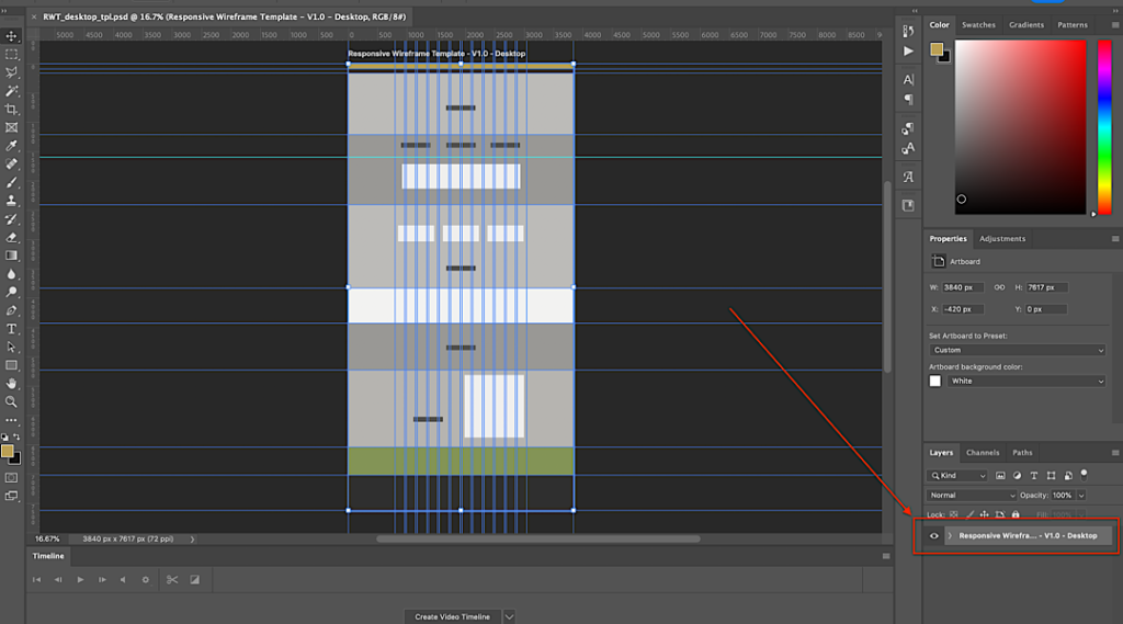
By creating additional guides to help define space and margin not only do you decrease your design setup time, you also keep consistency in your designs.
Once the initial strategic outline has been completed, research commences in the design and aesthetic to be used. This includes color scheme, fonts, and imagery.
I hope you found this article helpful in your journey to create the best websites possible. If you did, consider signing up for my newsletter to get future content like this direct to your inbox (unsubscribe at anytime). As a bonus I’ll gift you my mobile and desktop design templates as described in this article.


